Google Fonts Alternatives for Kinfolk Serif Font in 2026: 8 Fonts Compared

How we put this together: we compare official feature and pricing pages, app store listings, privacy policies and public user reviews. Prices change, so check the provider's site before you pay.
Key takeaways
- Playfair Display and Cormorant Garamond best capture a high-contrast editorial headline look, while Lora and Merriweather are better for long body text.
- Libre Baskerville and EB Garamond suit classic, book-like editorial pages, and Fraunces offers a modern variable font with optical sizes.
- All eight fonts on this list are free and open licensed through Google Fonts, so you can use them on a website, in print work or in a brand system without a licence fee.
- Test any serif at real sizes on a phone, because a font that looks elegant in a large headline can be hard to read in small body text.
Quick comparison
| Name | Who it suits | Starting price | Free option | |
|---|---|---|---|---|
 Playfair Display | Editorial headlines | Free | Yes | Visit |
 Lora | Warm body text | Free | Yes | Visit |
 Cormorant Garamond | Elegant display text | Free | Yes | Visit |
 Libre Baskerville | Classic book-like text | Free | Yes | Visit |
 EB Garamond | Classical editorial text | Free | Yes | Visit |
 Merriweather | Screen-friendly body text | Free | Yes | Visit |
 Crimson Pro | Literary long-form text | Free | Yes | Visit |
 Fraunces | Modern variable serif | Free | Yes | Visit |
The best Google Fonts alternatives for Kinfolk serif font
Kinfolk magazine is known for a calm, minimal editorial style: generous white space, quiet photography and a classic serif that feels warm rather than formal. There is no single Google font called Kinfolk Serif, so the task is to match that feeling, not to copy a name. The fonts below are free Google Fonts with a similar editorial character, from high-contrast display serifs for headlines to sturdy serifs for long reading. We compared official Google Fonts specimen pages, weights, styles and licence terms, and we focused on how each font behaves as a headline, as body text and on a phone screen.
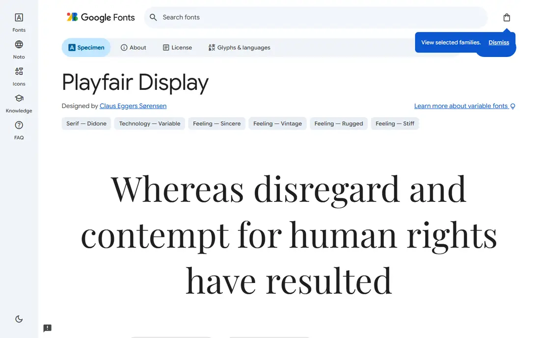
Playfair Display is the closest headline match for a Kinfolk-style editorial page. Inspired by transitional typefaces from the 18th century, it has strong contrast between thick and thin strokes, which gives headlines a refined, magazine-like presence. Used large, with generous line spacing, it instantly signals a lifestyle or cultural publication.
That contrast is also its limit. At small sizes, thin strokes can look faint on screens, especially on lower-resolution displays, so reserve Playfair Display for headlines, pull quotes and short display text. Pair it with a sturdy body font such as Source Serif 4 or Lora, and keep headline sizes large enough for the contrast to read clearly.
- High-contrast, elegant headlines
- Strong editorial character
- Variable weights and italics for display use
- Thin strokes can fade at small sizes
- Not ideal for long body text
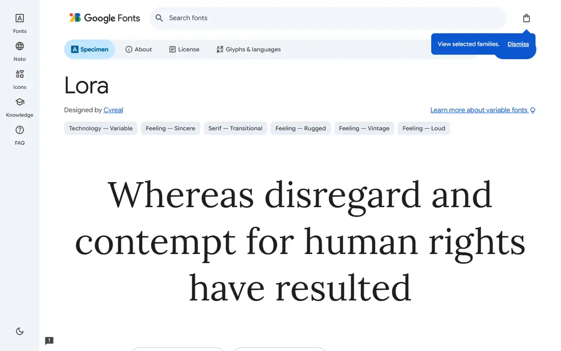
Lora is a contemporary serif with soft, calligraphic curves that feel human and warm, a quality that suits the Kinfolk mood well. It reads comfortably in long articles, essays and blog posts, and it also works for subheadings when set larger. Its variable font range lets a designer fine-tune weight for different sizes and screens.
Lora is less formal than Libre Baskerville or EB Garamond, which is a plus for lifestyle content and a minus for a very traditional publication. It pairs well with a clean sans serif for navigation and captions, and it holds up well on phones, where its open letterforms stay legible. For a site that needs one serif for both headlines and body text, Lora is a strong all-round pick.
- Calligraphic warmth with good readability
- Works for headlines and body text
- Variable font with a range of weights
- Less formal than a classic book serif
- Italic is distinctive, so use it sparingly in long text
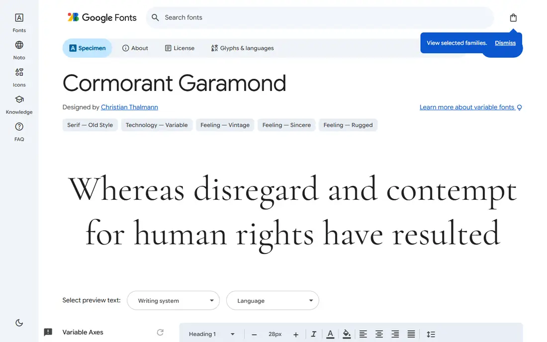
Cormorant Garamond is the most delicate font on this list, with fine, old-style forms that feel luxurious in large headlines, wedding-style layouts and fashion editorials. Its italics are particularly graceful, making it a good choice for pull quotes, captions and section openers where you want a quiet, refined touch.
It is not a workhorse body font. Light weights can disappear at small sizes, and long paragraphs in Cormorant Garamond tire the eye. Use it large, with plenty of space, and pair it with a sturdier body serif or a neutral sans serif. When used with restraint, it captures the calm elegance of a Kinfolk-style page better than almost any other free font.
- Very elegant, light display forms
- Many weights and styles
- Beautiful italics for quotes and captions
- Light weights are hard to read at small sizes
- Needs high-resolution screens and large sizes to shine
Libre Baskerville is a modern take on the classic Baskerville design, adjusted for comfortable reading on screens at body sizes. It has wider letterforms and a calm, book-like rhythm, which suits literary blogs, news sites and long-form magazines. If your Kinfolk-style project leans more classic than modern, Libre Baskerville gives that feeling without a licence fee.
Its weight range is limited, so it offers fewer headline options than Playfair Display or Fraunces. That is fine if you pair it with a display serif for headlines and use Libre Baskerville for body text, where it excels. For a publication that values tradition and readability over fashion, it is a dependable choice.
- Classic Baskerville character optimised for screen body text
- Comfortable for long reading
- Timeless, trustworthy feel
- Only a small set of weights
- Headlines feel traditional rather than modern
EB Garamond revives the work of 16th-century type designer Claude Garamond, adapted for modern screens. It has a classical, scholarly character that suits literary magazines, cultural essays and heritage brands. Its variable font offers a range of weights, and its italics are refined without being showy.
On screens, EB Garamond can look a little small and light, so set body text at a comfortable size, such as 17 or 18 pixels, with generous line height, and test it on a phone. Used that way, it gives a Kinfolk-style page a quiet, bookish elegance. For a more screen-first body font, Merriweather or Lora may be easier to read at small sizes.
- Classical Garamond revival with a scholarly feel
- Variable weights and italics
- Elegant for literary and cultural content
- Can look small and light on screens
- Needs careful sizing for body text
Merriweather was designed specifically for comfortable reading on screens, with sturdy strokes, a large x-height and open forms. That makes it one of the best body fonts on this list for a content-heavy site, even if it lacks the high-fashion elegance of a display serif. Readers can follow long articles without strain, which matters more than a pretty headline for a blog or magazine.
Use Merriweather for body text and pair it with Playfair Display or Cormorant Garamond for headlines to get both readability and editorial style. On its own, Merriweather feels practical and warm rather than luxurious, so it suits a Kinfolk-style site that prioritises reading comfort. For a site where most visitors read on phones, that practicality is a real advantage.
- Designed for comfortable screen reading
- Sturdy strokes and large x-height
- Wide weight range for hierarchy
- Less elegant than Playfair or Cormorant for display use
- Feels practical rather than luxurious
Crimson Pro is a serif family designed for book production and long-form reading, with a calm, literary feel that fits cultural and editorial content. Its variable font range gives designers many weights to build a clear hierarchy, from light captions to bold subheadings, without loading many separate font files. That flexibility also helps page performance when used carefully.
Crimson Pro is less distinctive as a headline font than Playfair Display, so pair it with a display serif if headlines need more character. As a body font, it is comfortable and unobtrusive, letting the writing and photography carry the page, which matches the quiet Kinfolk approach. For a long-form site, it is a refined, reliable choice.
- Book-like serif designed for long text
- Variable font with many weights
- Calm, literary character
- Less distinctive in headlines
- Smaller presence than Playfair for display use
Fraunces is a modern variable serif that updates an old-style design for contemporary use. Its optical size axis adjusts letterforms for small text versus large display, its weight axis covers a wide range, and a softness axis lets you tune how sharp or rounded the serifs feel. That control makes Fraunces unusually flexible for a Kinfolk-style system that needs one family for many uses.
The flexibility takes some learning, because a designer must test settings at headline, subheading and body sizes rather than picking a single weight. Used well, Fraunces can feel both classic and current, with a warmth that suits editorial content. If you want a single, modern serif family that can carry a whole site, Fraunces is the most versatile free option here.
- Variable font with optical size, weight and softness axes
- Modern take on an old-style serif
- Works for headlines and text
- Many axes can be confusing at first
- Needs testing at different sizes to get the best result
How we picked these
We compared official Google Fonts specimen pages, available weights and styles, and licence terms, and we checked that each specimen page loads and belongs to the font named. We favoured free, open-licensed serifs with an editorial character similar to Kinfolk magazine, covering both display and body use, rather than only headline fonts. We also noted where a font works best at large sizes versus body sizes, because that distinction decides whether a font suits a whole site or only part of it.
How to build a Kinfolk-style type system
Pick two fonts, not five. Choose one display serif for headlines, such as Playfair Display, Cormorant Garamond or Fraunces, and one body serif for long text, such as Lora, Merriweather, Libre Baskerville or EB Garamond. Add a neutral sans serif only for navigation, captions and small labels, and keep it quiet so the serifs carry the editorial voice.
Set type generously. Editorial design relies on white space, large headlines, comfortable body sizes and line height that lets text breathe. Test the combination on a phone at real article length, and check that headlines do not break awkwardly and body text does not feel cramped. Finally, load only the weights and styles you actually use, because loading a full variable font range or many weights can slow a page, especially on mobile connections.
A note on licences
All fonts on this list are available through Google Fonts under an open licence, which allows free use on websites and in print and brand work, with the licence terms shown on each specimen page. Check the licence if you modify a font or embed it in a product for resale, and keep a note of the font version you used for a brand system.
Frequently asked questions
What is a good Google Fonts alternative for Kinfolk serif font?
Playfair Display is the best headline alternative, and Lora is the best all-round alternative for a Kinfolk-style editorial look. Cormorant Garamond suits elegant display text, while Merriweather and Libre Baskerville suit long body text. The best choice depends on whether you need a headline font, a body font or one family for both.
Which Google font is closest to Kinfolk magazine style?
No Google font is an official Kinfolk font, because Kinfolk is a magazine brand, not a Google font name. Playfair Display and Cormorant Garamond best capture its high-contrast editorial headline feel, while Lora and EB Garamond capture its warm, literary body text feel. Pair a display serif with a readable body serif for the closest overall system.
Are these Google Fonts free for commercial use?
Yes, the fonts on this list are free and open licensed through Google Fonts, which allows commercial use on websites and in print work under the terms shown on each specimen page. Always check the licence on the specimen page for your specific use, especially if you modify the font or embed it in a product.
What pairs well with Playfair Display for body text?
Lora, Merriweather and Source Serif 4 all pair well with Playfair Display, because they are sturdy enough for long reading while Playfair carries the headlines. For navigation and captions, a neutral sans serif such as Inter or a similar clean sans keeps the page calm. Avoid pairing two high-contrast display serifs, because they compete for attention.
Which serif font is best for long-form reading on a screen?
Merriweather is the best screen-first body serif on this list, followed by Lora and Libre Baskerville. Merriweather was designed for screen reading, with sturdy strokes and open forms, while Lora adds warmth and Libre Baskerville adds a classic book feel. Test body text at 17 or 18 pixels on a phone before you decide.
Can I use these fonts in print as well as on a website?
Yes, Google Fonts can be downloaded and used in print design as well as on websites, under their open licences. Download the font files from the specimen page, install the weights you need and keep the licence note with your brand files. For print, test the font at the exact size and paper stock you will use, because screen rendering differs from print.
Sources we checked (8)
- https://fonts.google.com/specimen/Playfair+Display
- https://fonts.google.com/specimen/Lora
- https://fonts.google.com/specimen/Cormorant+Garamond
- https://fonts.google.com/specimen/Libre+Baskerville
- https://fonts.google.com/specimen/EB+Garamond
- https://fonts.google.com/specimen/Merriweather
- https://fonts.google.com/specimen/Crimson+Pro
- https://fonts.google.com/specimen/Fraunces

Online Jobs is an independent blog about careers, online work, learning new skills and the tools that help people earn. More about us.
Keep reading
All posts
ZoomInfo Alternatives
The best ZoomInfo alternatives in 2026, compared on price, free plans, data coverage, and which tool fits small teams or large sales teams best in detail.
Workday Alternatives
We compared the best workday alternatives for HR, payroll, and global hiring, from BambooHR and Gusto to Rippling, Deel, and HiBob for growing teams in 2026.

Which SaaS Tools Have the Best Customer Support
Which SaaS tools have the best customer support? Compare eight popular tools on help centres, live help, response options and overall support quality.