Alternatives to Flexbox in 2026: 8 Layout Tools Compared

How we put this together: we compare official feature and pricing pages, app store listings, privacy policies and public user reviews. Prices change, so check the provider's site before you pay.
Key takeaways
- Native CSS Grid is our first pick for two dimensional page layouts, since rows and columns are handled together in one system.
- Bootstrap and Foundation suit teams that want ready made components plus a grid, while Tailwind suits teams that want fine control in markup.
- Lightweight options such as Pure.css and UIkit make sense for smaller sites where a large framework would add weight for little gain.
- No single option replaces Flexbox for every job, so many teams use Grid for page structure and a framework for components.
Quick comparison
| Name | Who it suits | Starting price | Free option | |
|---|---|---|---|---|
 CSS Grid | Two dimensional page layouts | Free | Yes | Visit |
 Bootstrap | Ready made components and grid | Free | Yes | Visit |
 Tailwind CSS | Utility first custom design | Free | Yes | Visit |
 Foundation | Large responsive sites | Free | Yes | Visit |
 UIkit | Lightweight modular interfaces | Free | Yes | Visit |
 Materialize | Material Design style sites | Free | Yes | Visit |
 Pure.css | Tiny CSS only projects | Free | Yes | Visit |
 Chakra UI | Accessible React components | Free | Yes | Visit |
The best alternatives to flexbox
Flexbox is excellent for one dimensional rows and columns, but it is not the only way to lay out a page. We compared native CSS, full frameworks, and lighter libraries, judging them on layout control, learning curve, component range, and how much code they add to a project.
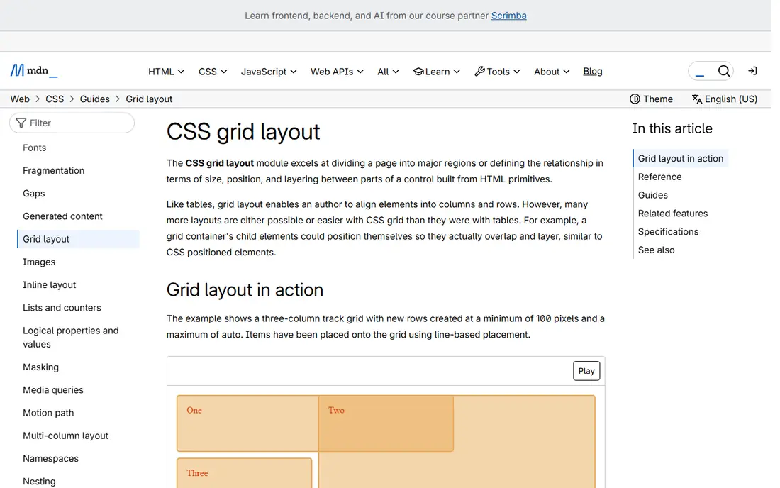
CSS Grid is the closest native replacement for Flexbox when a layout needs both rows and columns at once. You define a grid on a container, place items by line or area, and let the browser handle alignment, spacing, and wrapping. That makes it a strong choice for full page shells, dashboards, and card layouts where items must line up in two directions.
The trade off is that Grid is a layout system, not a component library. It gives you no buttons, forms, or navigation bars, so you still write those styles yourself or pair Grid with another tool. Teams that want full design control often like that freedom, while teams that want speed may prefer a framework that ships components as well.
- Built into browsers with no download
- Handles rows and columns together
- Precise control over placement and gaps
- Older browser support needs care
- Learning the syntax takes time for beginners
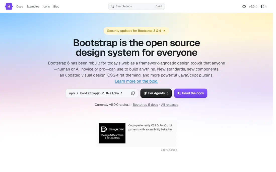
Bootstrap pairs a 12 column grid with buttons, cards, modals, navigation, and forms, so a team can build a complete interface without starting from a blank stylesheet. Its grid uses classes in markup, which makes responsive behaviour easy to read and change, and its documentation covers most common patterns with examples.
The honest catch is visual sameness. An uncustomised Bootstrap site is easy to spot, and trimming unused parts takes extra build work. If you plan to restyle heavily, a utility first tool may give you a cleaner starting point, but for internal tools, prototypes, and client sites on a deadline, Bootstrap remains a practical pick.
- Large component library and clear docs
- Responsive grid with many breakpoints
- Huge community and themes
- Sites can look similar without custom styling
- Bundle size is larger than a tiny library
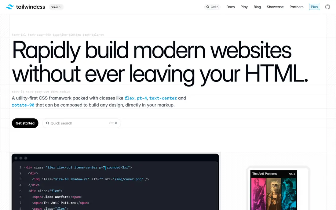
Tailwind takes a different path from Bootstrap. Instead of ready made components, it gives you small utility classes for spacing, colour, layout, and typography, and you combine them in HTML to build exactly the design you want. Its grid and flex utilities sit side by side, so you can use Grid for page structure and still use small layout helpers where they fit.
That freedom comes with verbose markup, and a large page can be hard to scan until you learn the naming patterns. Extracting repeated patterns into components helps a lot. For teams that want a custom look without maintaining a large stylesheet, Tailwind is often the best balance of speed and control.
- Fine grained control without writing custom CSS classes
- Unused styles can be removed in production
- Strong responsive and state variants
- Markup can become long and busy
- Learning the class names takes a few projects
Foundation has long been aimed at professional and agency teams building responsive sites at scale. Its XY grid gives you control over both axes, and its components cover navigation, forms, modals, and interchange patterns for different screen sizes. Accessibility support is a clear strength, which matters for public sector and large commercial sites.
The downside is momentum. Fewer tutorials, themes, and third party plugins appear for Foundation than for Bootstrap or Tailwind, so you may solve more problems on your own. If your team already knows it, or you need its particular grid behaviour, it is still a solid and dependable choice.
- Flexible grid with XY grid options
- Accessible components
- Suited to enterprise and agency work
- Smaller community than Bootstrap
- Some parts feel dated compared with newer tools
UIkit is a modular front end framework with a grid, navigation, cards, forms, and JavaScript components such as sliders and lightboxes. You can load the whole library or pick modules, which helps keep pages lean. Its default look is tidy without being as instantly recognisable as Bootstrap, so custom sites need less undoing.
Its community is smaller, which shows up in fewer tutorials and integrations. For a small to medium site, a marketing page, or a web app where you want components without a heavy framework, UIkit hits a useful middle ground between a tiny library and a full design system.
- Modular, so you can include only what you need
- Clean default styling
- Good grid and component range
- Smaller ecosystem than the biggest frameworks
- Fewer ready made themes
Materialize implements Google Material Design ideas in CSS and JavaScript, with a responsive grid, cards, buttons, collections, and animated components. If you like that visual language, with shadows, ripples, and bold colour, you can get a polished site quickly without designing every component from scratch.
The risk is maintenance pace and fit. Projects that need a very different visual identity will fight the defaults, and you should check the current release status before starting a long lived project. For prototypes, admin panels, and sites where Material styling is a good match, it remains an easy route.
- Clear Material Design look out of the box
- Grid plus cards, chips, and modals
- Easy for beginners to start
- Development pace has been uneven
- Custom designs outside Material style take more work
Pure.css is a set of small, responsive CSS modules for grids, forms, buttons, tables, and menus. It is built to stay tiny, so it suits landing pages, simple sites, and projects where every kilobyte matters. Its grid uses fractions, which makes common splits such as halves and thirds easy to express.
What you gain in size, you lose in ready made parts. There is no modal, slider, or rich navigation component here, so teams that need those will add their own code or pair Pure.css with small JavaScript libraries. If your layout needs are simple and speed matters, that trade is often worth it.
- Very small file size
- Simple grid and base styles
- No JavaScript required
- Few components
- You build most custom elements yourself
Chakra UI is a React component library with layout primitives such as Stack, Grid, and SimpleGrid, plus forms, modals, and navigation. Its layout components wrap CSS Grid and Flexbox in a consistent prop system, so React teams can build responsive layouts without writing a separate stylesheet for every screen.
The limit is scope. Chakra only makes sense inside a React project, and teams using Vue, plain HTML, or server rendered pages will need a different tool. Inside React, though, its accessibility defaults and theming save real time, and it is a strong pick for dashboards and product interfaces.
- Accessible components by default
- Style props speed up React work
- Theming is straightforward
- React only, so it does not fit plain HTML or other frameworks
- Bundle needs care on large apps
How we picked these
We compared official documentation, grid behaviour, component range, and pricing pages, and we checked that each official site loads and matches the product named. We favoured tools that are still maintained, that work in current browsers, and that offer a genuinely different approach from writing Flexbox by hand, whether that is a native layout system, a full framework, or a small library. We did not claim hands on testing; our judgement rests on the published docs, feature lists, and public community material we reviewed.
Choosing the right layout approach
Start with the shape of your page. If the layout is a true grid, with items that must align across rows and columns, CSS Grid is usually the cleanest tool, and it pairs well with any component library. If the layout is a simple row, a toolbar, or a centred group, Flexbox itself may still be the right call, and there is no need to replace it everywhere.
Next, weigh how much design work you want done for you. A full framework saves time on buttons and forms but adds weight and a house style to undo. A utility tool gives you control at the cost of longer markup. A tiny library keeps pages fast but leaves more building to you. Pick the option that matches your team size, deadline, and design ambition, and keep the layout layer as simple as the page allows.
Frequently asked questions
Is CSS Grid a direct replacement for Flexbox?
Grid replaces Flexbox well for two dimensional layouts, such as page shells and galleries, but Flexbox remains handy for one dimensional rows, centring, and distributing space inside a component. Most modern sites use both, each where it fits best.
Do I need a framework to avoid Flexbox?
No. Native CSS Grid, plus modern features such as container queries and subgrid support in current browsers, covers many layouts without any framework. A framework helps when you also need components, theming, and responsive patterns ready made.
Which option is best for beginners?
Bootstrap is often the easiest starting point because its docs and examples cover complete pages, while Pure.css is simpler if you only need a grid. Tailwind takes longer to learn, but many beginners like it once the class names click.
Can I mix Grid with a framework?
Yes, and this is common. You can use Grid for the page shell and a framework for buttons, cards, and forms, or use framework grid classes for most sections and Grid where precise placement matters. Just avoid loading two full frameworks at once.
What about older browsers?
Current versions of Grid and the frameworks listed here work in modern browsers. If you must support very old browsers, check each tool docs for its support table and test the layout, since Grid features such as subgrid have narrower support than basic grid.
Sources we checked (9)

Online Jobs is an independent blog about careers, online work, learning new skills and the tools that help people earn. More about us.
Keep reading
All posts
Best AI Tools for Web App Development
Compare the best ai tools for web app development, from prompt-to-app builders to AI code editors, with pricing, free plans and honest trade-offs for 2026.
Alternatives to Sass
Searching for alternatives to sass? We compare 8 tools, from Less and PostCSS to Tailwind and Lightning CSS, so you can choose with confidence today now.

Alternatives to Less
Looking for alternatives to less? We compare 8 tools, from Sass and Stylus to PostCSS, Tailwind, and native CSS, to help you choose the best fit today.